Our Work Swago
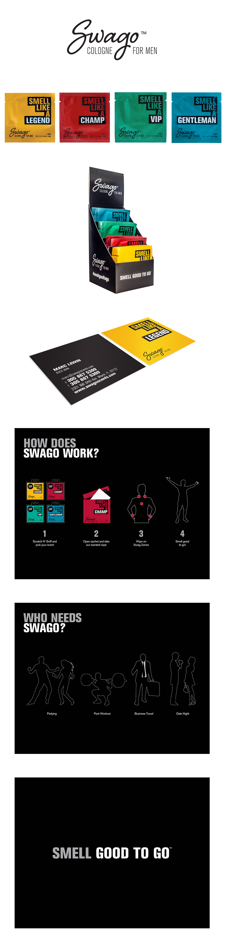
When Swago came to us with never-before-seen, palm-sized cologne sachets, we knew they had a disruptive product that would change the face of the men's fragrance market. Inspired by their fresh and energetic vibes, we set out to create a visual identity that was clean, direct, and easy to recognize. We came up with the "Smell Like A ____" concept to evoke the brand's fun, masculine identity.
Approach. At first, we faced a few challenges. We had to ensure product packaging looked masculine, seeing as wipes are usually associated with women's products. This is how the "Smell Like a…" concept was born, an inventive approach to product terminology that made the Swago brand versatile enough to introduce as many scents as they please. We used four bold, traditionally male hues to distinguish the character of each scent. The typography is equally boisterous, so the message is hard to ignore. Everything else surrounding the brand is black to not only make the colored sachets pop, but also give the brand a sleek and sophisticated feel.